Consent-touch icon — redone
You said the old one looked like a plant or a snake vomiting fingers. You were right.
Craftee · 2026-07-12 17:50 WEDT · now
What went wrong

Splayed individual fingers. At 42px, separate fingers stop reading as a hand
and become tendrils spraying out of a stalk. Every other icon in the set is flat and abstract —
the circle icon is just dots, the connection icon is two rounded bodies with no faces. This one
tried to draw anatomy at chip size.
The rule I used for the redo: a hand is one silhouette — palm, one domed finger-mass, a thumb. Never separate fingers. And the consent is what the icon is actually about, so the yes gets its own mark (the spark), rather than the touch being the subject.
Pick one — tap to compare
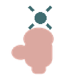

The Ask
One open palm offered, the yes rising from it.
MY PICK
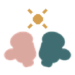

Two Yeses
Both hands offer, neither reaches in. One shared yes.
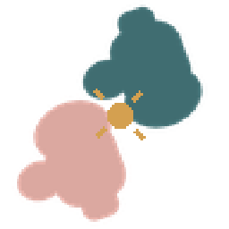

Offered & Chosen
A hand offered, a hand meeting it — the gap between is the consent.
muddy at chip
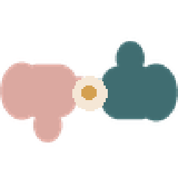

The Pause
Held apart by a breath — the pause before contact.
muddy at chip
Big view is pixel-doubled so you see exactly what the 42px chip does — no flattering blur.
In place, on the real screen

Soft social connection
Gentle, low-pressure closeness — no performance required.
Consent-based touch
Every touch offered and chosen — held with care.

Smaller, better-held gatherings
Fewer people, more care — a gathering you can actually feel held in.

Community without one heroic host
A circle of peers — everyone contributes, no single hero.
Tap a candidate above and this row swaps live, so you can judge it against its neighbours.
One call: The Ask (my pick) or Two Yeses? My pick is already staged in the app as
benefit-consent-v2.png — Cody flips the filename the moment you say a word, no rebuild
of anything else.